Challenge
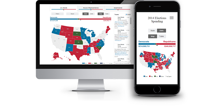
Right&Above received a request to develop an interactive map displaying the correlations between the clients’ expenses and geography over time (primary and general election), targeted at clients working on campaigns. The challenge was to create a user-friendly and easily accessible product for non-technical business users to help them see the key information in a concise and clear way.
Solution
To meet the requirements, we covered the following areas:
User Interface (UI) Design
Our team created a clear and bright design, and developed a Twitter bootstrap theme to implement it. The design was specifically developed to accommodate different screen sizes and device types.
Technologies
The project was implemented using Java on the server side (Spring, JDBC) and HTML5 stack on the client side. Charts and Maps were implemented using d3js library. A lot of work was undertaken to plot spending information by US states and designated market areas into the map.
We made it possible for users to access the new visualizations via a web browser on a desktop/laptop (Windows/OSX), a tablet (iOS/Android/Windows), and mobile (iOS/Android) devices. Chrome, Firefox, and Safari are all fully supported.
Mobile Optimization
We optimized the product’s user interface to look perfect on various screen sizes – mobiles, tablets and desktops. The website provides slightly different user experience (UX) for different device types: UI controls and the number of available features are different for mobiles and desktops.
Twitter Integration
The application displays recent tweets using Twitter widget for websites.
General Features
- Timeline – We created a timeline that allows users to see the spending increases or decreases over time, starting with primaries and continuing into the general election. Users are also able to select a specific start and end date for the period they require.
- Roll Over Feature – This feature allows choosing a specific state or designated market area and viewing a breakdown of spending by clients, candidates, issue groups, or party affiliation.
- Spotlight Feature – It allows plugging in a client and showing the received results on the timeline.
- Data Table – It made possible for users to view the underlying data in a table format within the window.
Ultimately, we have succeeded in designing a product that provides actionable information, through a clear well-designed interface and presenting the latest insights on spending by campaigns and issue groups.


